Good UI Sighting
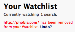
Technorati has a wonderful solution for shielding users from accidental destructive action: offer an undo link along with the response message:

This is much less disruptive than an “are you sure?” dialog, which are often ignored by confirmation fatigued users. It may seem too subtle, but designers are already tasked with tastefully drawing attention to response messages, and a user that’s just made a mistake will be willing to invest a few seconds of attention.
I posted this in May 2006 during week 1681.
For more, you should follow me on the fediverse: @hans@gerwitz.com