Gerrymandering
Updated February 2019
It’s inevitable that we carve up geography to group people. Political borders are usually the result of negotiations between land-hungry powers, or politicians seeking to tweak group distribution.
Julian Oliver’s Border Bumping project has me thinking again about alternate motivations, so I’ve assembled some of my favorite alternative approaches to US cultural cartography:
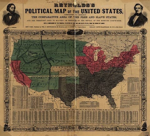 William C. Reynold’s slavery map was one of the first artifacts that piqued my schoolboy interest in cartography. It may be quite simplistic, but was (and remains) very effective in communicating the state of the nation in 1856.
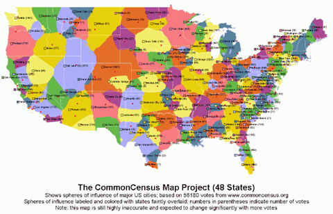 Michael Baldwin’s Common Census is my modern favorite, built by voluntary association with named places. It should be no surprise that cities are highly influential.
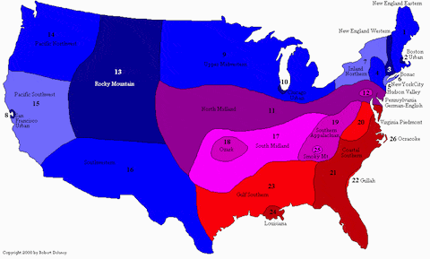 Another favorite view is Robert Delaney’s dialect regions, or Rick Aschmann’s similar work.
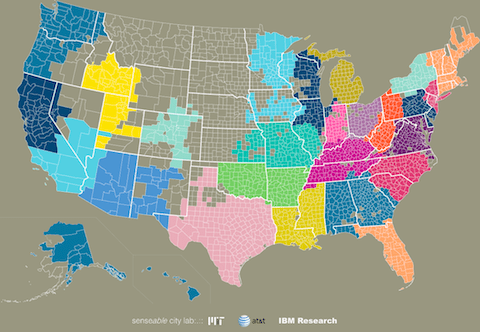 Also using communication, MIT, AT&T, IBM, and probably some other TLAs have mapped socially connected regions based on mobile phone calls. Then with Vincent Blondel (of phone identification fame) they went meta.
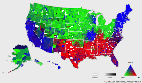 Alan McConchie has an ongoing project to track what Americans call soft drinks that shows some pretty clear boundaries.
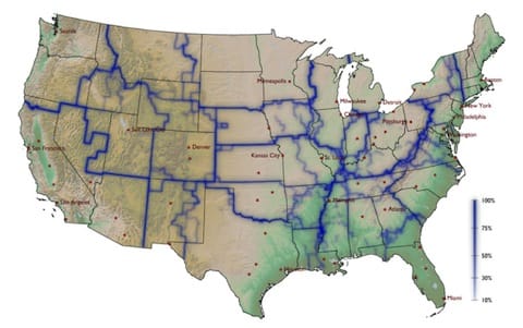 Dirk Brockmann got a lot of attention mapping areas of mobility using paper currency tracking as a proxy and points out it corresponds well to BEA Economic Areas.
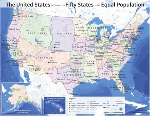 Neil Freeman has drawn fifty states of equal population.
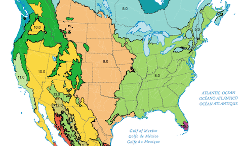 I wouldn’t be a proud citizen of Cascadia if I didn’t include ecoregions.
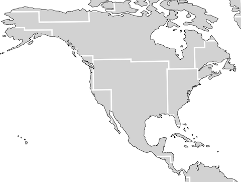 With a midnight mapping of star constellations to Earth’s surface, Jim Davenport also finds a Cascadia in Corona Borealis.
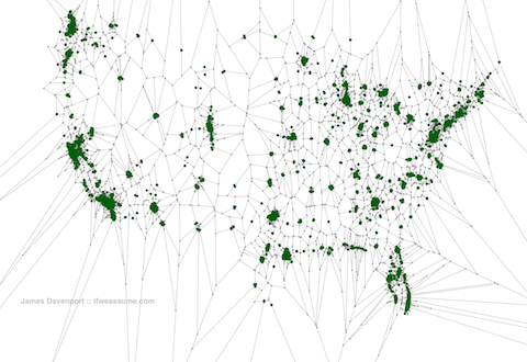 Davenport also cleverly uses Voronoi diagrams to define states based on distance from Starbucks.
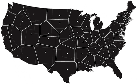 Jonathan Dowse also uses Voronoi cells, but choses existing state capital cities for the vertices.

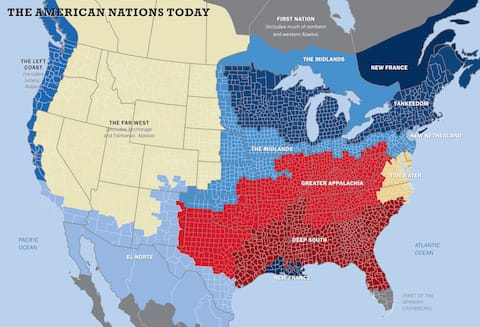 Colin Woodard looks to history to inform 11 nations of distinct cultures.
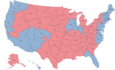 Neil Freeman generated a fictional states map that would award Democrats the presidency every time this century.
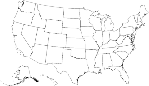 Kevin Hayes Wilson built a more nuanced tool to redraw the states for speculative electoral outcomes for the 2016 presidential election. With it, he discovered very small tweaks like subtle shifts to the Wisconsin-Illinois and Florida-Alabama borders would have tipped the scales to Hillary Clinton.
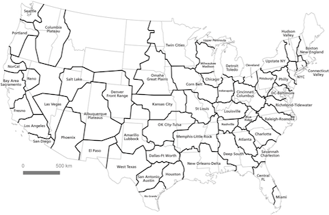 Alasdair Rae and Garrett Nelson studied commuter patterns which suggest megaregion partitions.
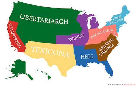 Rob Beschizza shows us what 8 states of populations equal to California would look like.
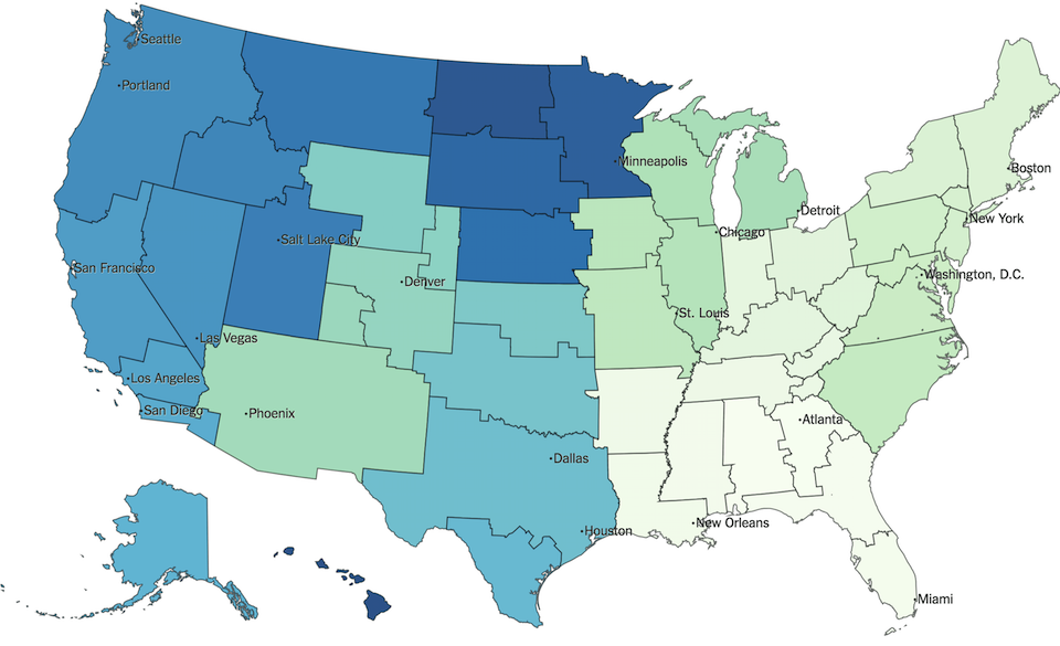 Emily Badger and Quoctrung Bui of the New York Times use clusters of social connection and find that state lines are strong boundaries.
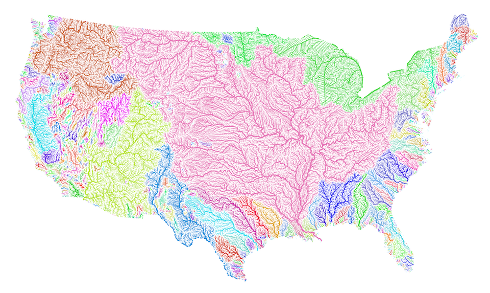 Robert Szucs colored watersheds, which implies divisions but is suitably chaotic in the Great Basin.
I posted this in April 2013 during week 2043.
For more, you should follow me on the fediverse: @hans@gerwitz.com